DI's Marketing Coordinator, Joanna Hammond, reviews the top three improvements made during DI's recent website refresh.
Three Major Improvements From Our Website Refresh
You may have noticed recently that the Destinations International website has gotten a bit of a makeover. No, this was not the work of the cast of the hit early 2000’s TV show Extreme Makeover: Home Edition, but the result of hard work by our marketing team and partners at Miles Partnership. Thanks to our friends at Miles for turning our visions into reality! I am excited to share with you three major improvements that have come to life in our website refresh.
More Dynamic Home Page
Firstly, I would like to shout out the major upgrade to the homepage. Our homepage is much more dynamic than it was before, as it now features a large hero image as the first thing you see when you get to our site. This is a great way for us to prominently feature any relevant and timely pieces of information on our site, making it easy to find, click, and take action. For example, right now we are featuring the Annual Convention, so you can quickly find more information about the event and register easily with just a few clicks. This will also be true for all of our events in the future.

Optimized Menu Navigation

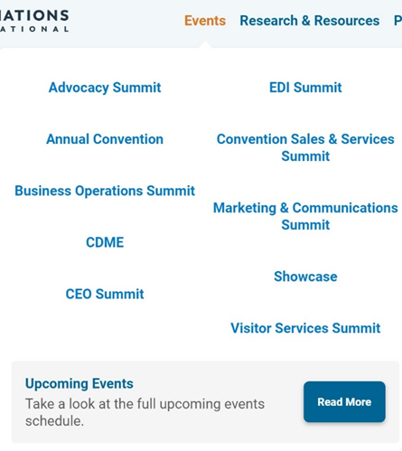
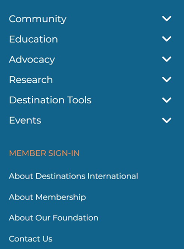
Next up is our menu navigation. You may remember our menu navigation on the old website was a blue vertical menu on the right-hand side of the homepage (image below). We have majorly improved it by implementing a new horizontal menu with more accurate categories so you can easily and quickly find whatever you are looking for on the DI site. For example, above is a screenshot of the events category. You can easily find all our events here, as well as the full calendar of upcoming events. This optimization will make it a lot easier to find exactly what you’re looking for on our website.

More Visual Blog
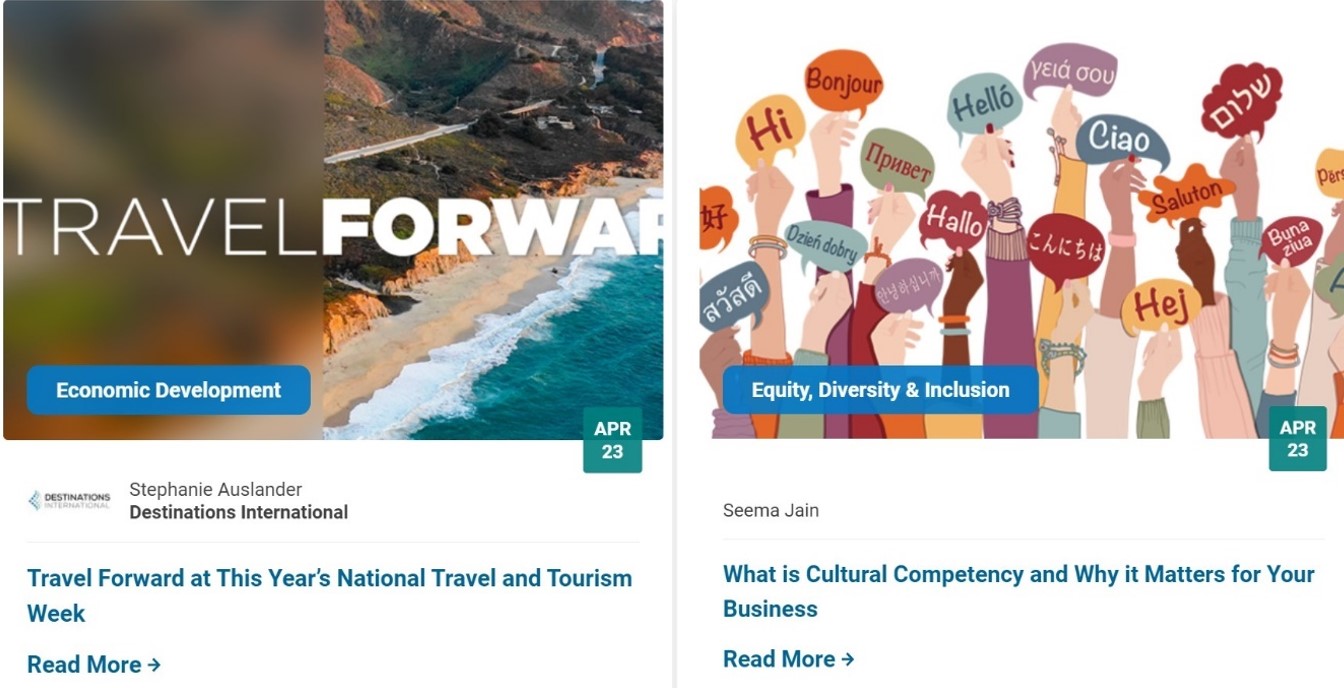
Lastly, I wanted to call out the improvement we’ve made to our blog! If you remember our old blog, it looked like a long list of titles and authors without a lot of context about what each blog was about. Now, you can see our new blog is much more visually appealing, with bold images and prominent titles. We are also now featuring these new blue content themes on each blog that indicate the topic of the blog so you can quickly decide if it would be of interest to you. Additionally, you can search by these categories to find more blogs in the topic areas that interest you most.

Our website refresh didn’t stop there! If you spend just a few minutes poking around on our new website, you will be sure to notice plenty of updates and improvements (not to mention, our new logo and branding!). However, with a new website, bugs and broken links are part of the process. If you run into a broken link or issue with a webpage, please do not hesitate to reach out to me at [email protected].


